Psychology of Shape
Our subconscious minds respond in different ways to different logo shapes. Straight lines, circles, curves and jagged edges all imply different meanings and so we can use shape to infer particular qualities about the brand in your Monthly Marketing Plan.
The shape of your logo says a lot about your business. It can tell clients if you are reliable, friendly, welcoming, sophisticated, or heritage. Just like color, logo shapes have meaning.
Sharp and Angular
These shapes are perfect for communicating power, intelligence, or stability.
Attributes to a Sharp & Angular design:
- Liveliness
- Action


Square
A defining feature which separates angular shapes from soft shapes is in the presence of corners. Corners are, by definition, sharp and abrupt. As squares and rectangles have straight lines and right angles they have a very mathematical, balanced feel. What does this mean for your business?
Squares are used to represent professionalism, stability, and control for a company. This shape also portrays maturity and intelligence. All websites are made up of a grid pattern using rectangles and squares. The eye reads theses shapes easily which is why the most text is contained within these shapes.
Attributes to a Square design:
- Trust
- Stability
- Uniformity
- Honesty
- Security

Circular
Circles, ellipses, and ovals can portray many values and feelings. While the soft and gradual curves of circles often lend themselves to gentler applications, these shapes also have a history of being used as a symbol for tradition and authenticity. These rounded shapes tend to send a positive emotional message of harmony and protection.
Attributes to a Circular design:
- Completeness
- Movement
- Protection
- Intellectualism


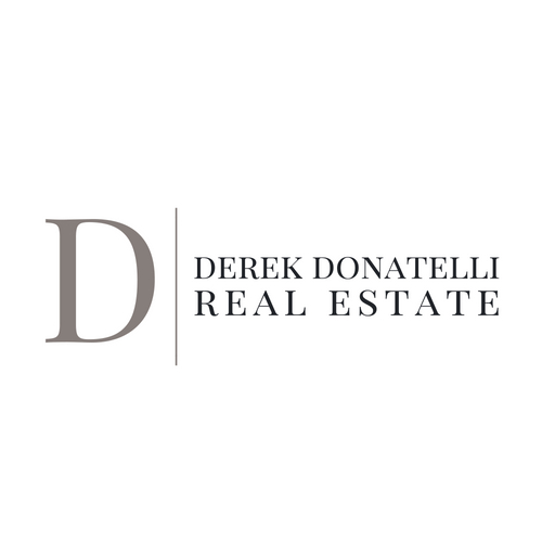
Vertical Lines
Another form which logos take on is one composed of lines. Vertical lines feel powerful and established, like a stake in the ground. Vertical lines are used to represent superiority and strength.
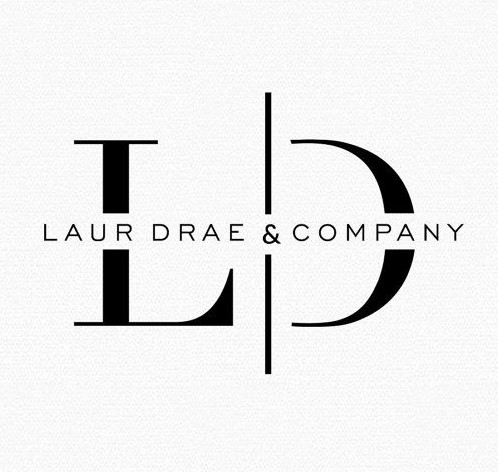
Horizontal Lines
In contrast to vertical lines, horizontal lines are grounding. They can make a logo feel calm and secure. In the example above horizontal lines are used to represent communication and calmness for a company which brings together information and communication.


Attributes to a line design:
Courage
- Domination
- Boldness
- Growth
